
What To Look For
When we make updates, sometimes no changes are needed to maintain the website’s previous “look,” while other times there may be significant edits required. When reviewing a website after an update, approach it with the mindset of “What can I find that needs editing?”
An eye for detail is crucial. Reviewing a website isn’t just a quick glance or clicking through pages—it’s about identifying inconsistencies such as:
-
Spacing issues
-
Photo sizing differences
-
Font size variations
-
Outdated dates
-
Anything that appears out of place or misaligned
Key Tip: Know our websites inside and out. When getting started, review every page before an update so you can easily spot what needs attention afterward. If something is unclear, always ask—there’s no substitute for clarification.
Be thorough, critical, and proactive in your review. Over time, this attention to detail will help you ensure that every website update preserves the high standard of quality our clients expect.
Look At The Below Images And See What’s Wrong
Below are not all of the website problems that occur when reviewing an updated website but rather a few examples of what to look for…both easy and having an EYE FOR DETAIL. Again, ask yourself, what can I find for an edit!
Screenshot 1

Problem: “Women’s Sporstwear” needs to be on one line.
Screenshot 2
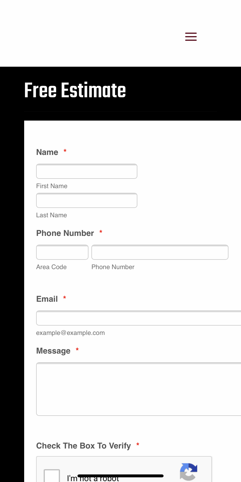
Problem 1: The form is off the page (right justified), also the form informaton needs to be in the fields.
Problem 2: The hamburger menu at the top of the page needs to be larger.
Screenshot 3
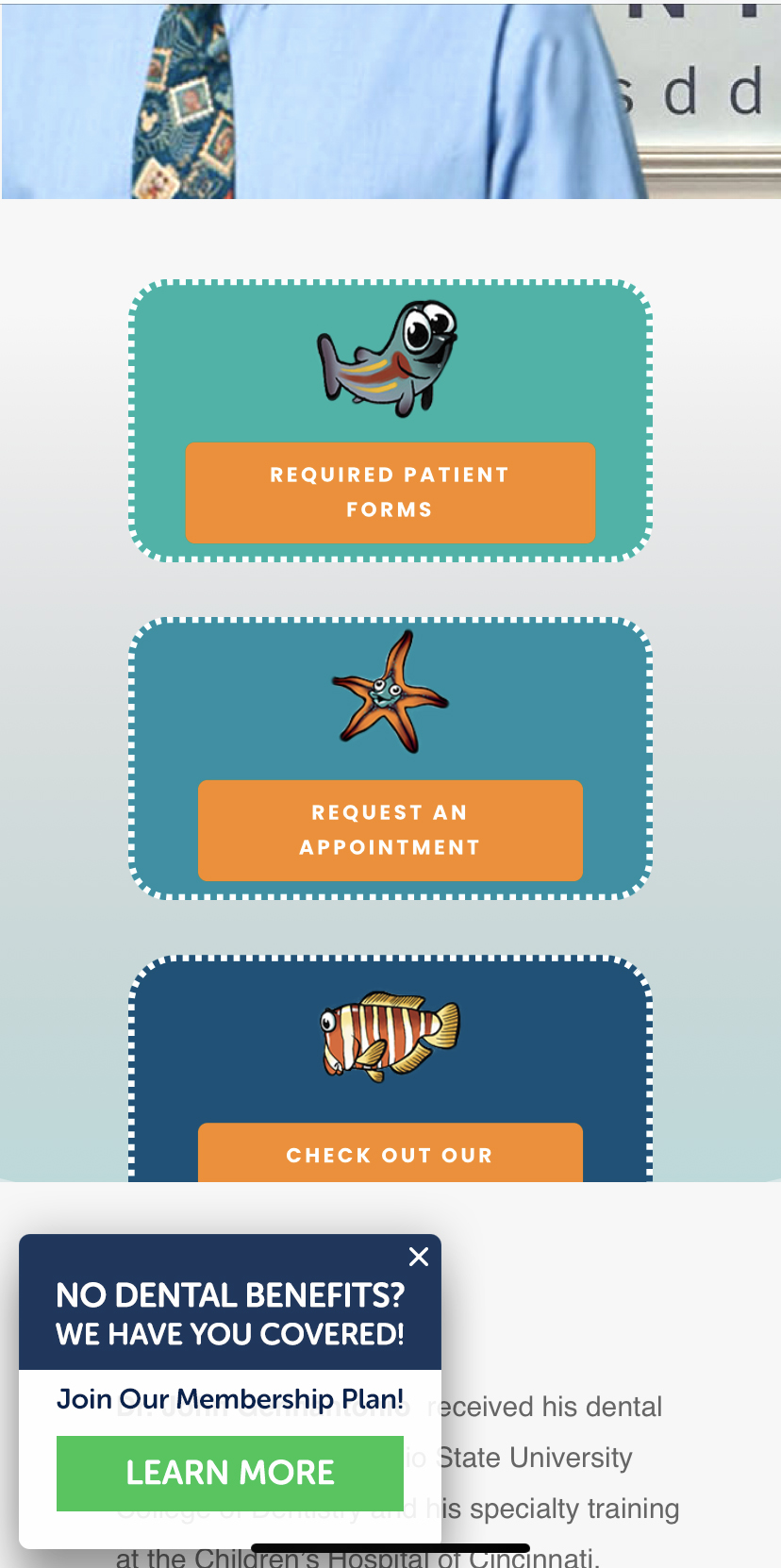
Problem: The third box is cut off and you can’t see anything other than “Check Out Our…”
Screenshot 4

Problem: The menu bar isn’t legible for the second line.
Screenshot 5

Problem 1: The menu button is off the page.
Problem 2: The hamburger menu at the top of the page needs to be larger.
Screenshot 6
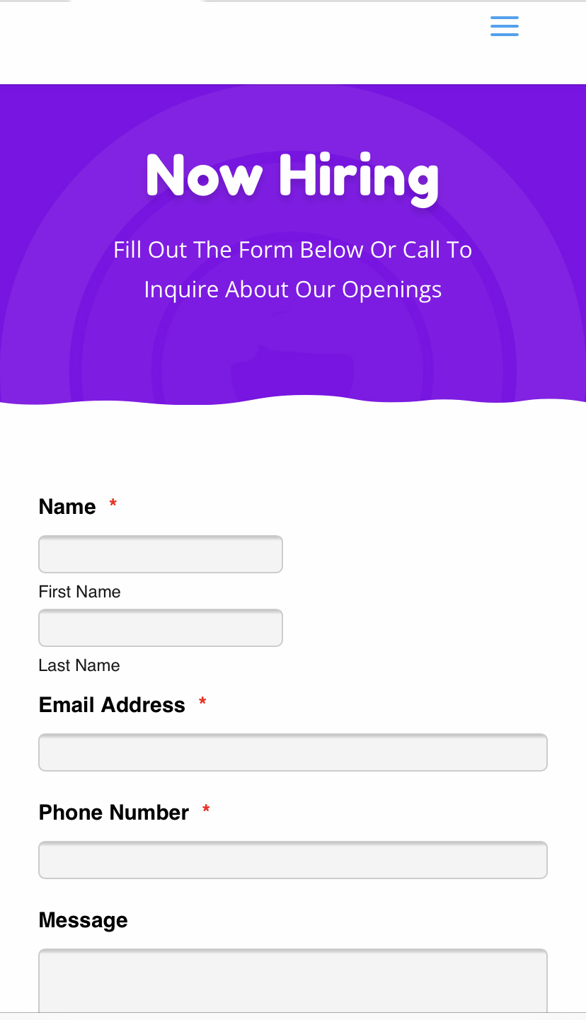
Problem: The form name is on 2 lines and the fields should be placed within the form fields.
Screenshot 7
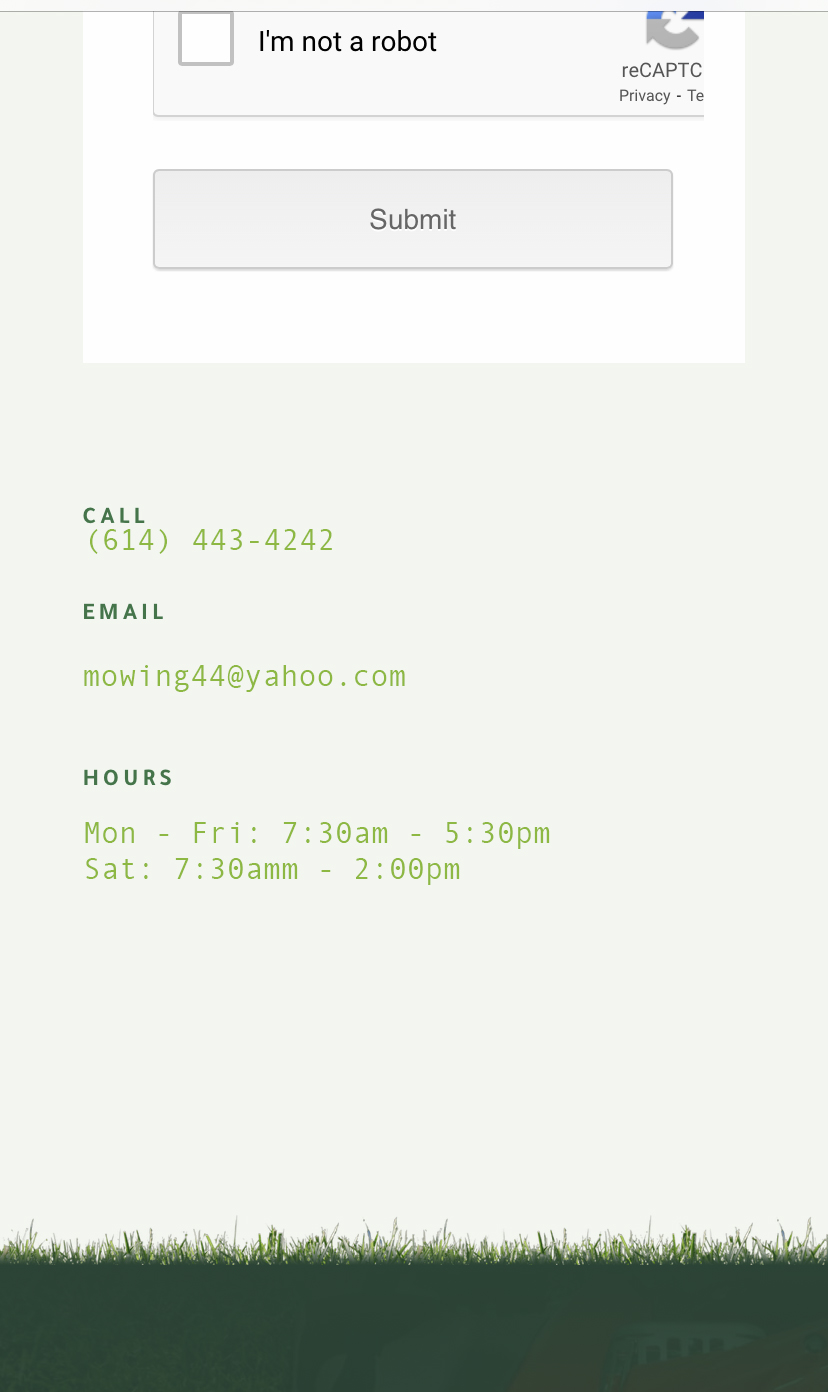
Problem: There is no spacing under call but spacing under email and hours.
Screenshot 8

Problem: The left and right of the photo has spacing, remove spacing on the left and right.
Screenshot 9

Problem: Remove the white background color between the grey backgorund and the burgondy background. After the edit, the grey background and burgany background should touch.
Screenshot 10

Problem: The left side of the page is cut off. When you scroll on a cell phone try to scroll left and right, if it allows you to scroll left and right, you’ll want to fix this with CSS margins.